Fully Tappable Rows In SwiftUI Lists And My Journey To Them
The Problem
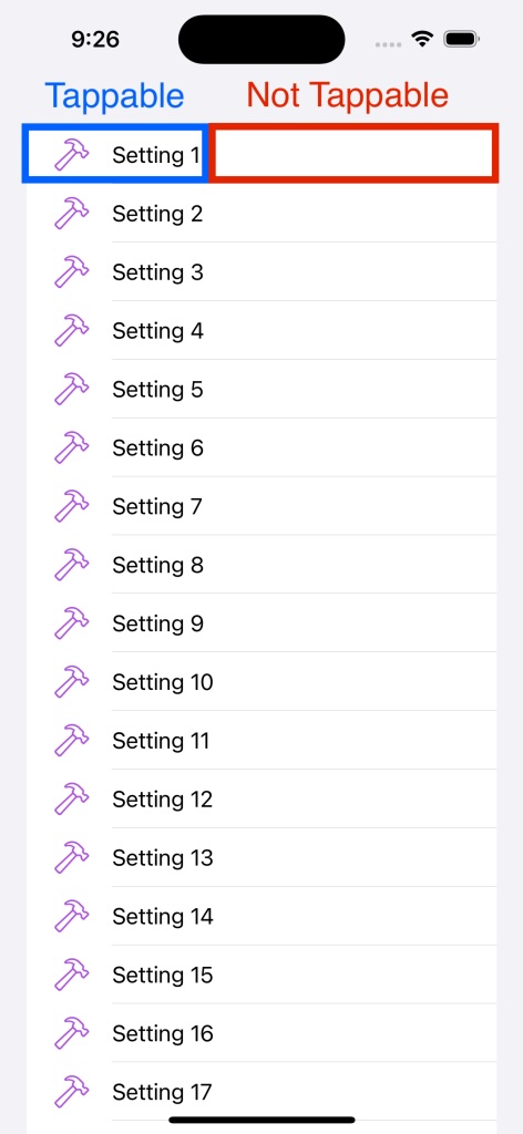
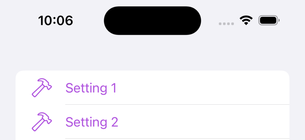
In my new app BLE Discover, I set out to build a settings page with a fairly basic list of items, which when tapped present a new view modally. Seems easy enough right? Just add a tap gesture to each view in the list. But when I went into testing, I noticed that not all of my list item row was tappable, in fact, only the portion with content was (Label containing a system image and text). So what was going on? Read on to follow my journey into figuring it all out.
TL;DR – If you are here just looking for the solution and not my ramble, jump to the conclusion below.
Tip: This behaviour actually comes for free in lists if using NavigationStack and NavigationLink wrapped items. I was trying to do something which deviated from the iOS UX norm here, using a modal presentation, albeit not necessarily unusual.
Here is a simplified version of my code:
import SwiftUI

struct ContentView: View {
    var body: some View {
        List {
            ForEach(1..<20) { num in
                HStack {
                    Label("Setting \(num)", systemImage: "hammer")
                }
                .onTapGesture {
                    print("Tapped setting \(num)")
                }
            }
        }
        .tint(.purple)
    }
}
So it seems that although I am applying a modifier to the HStack, only the content of the Label is tappable. Adding a background colour to the HStack to quickly debug, the problem becomes easy to see:
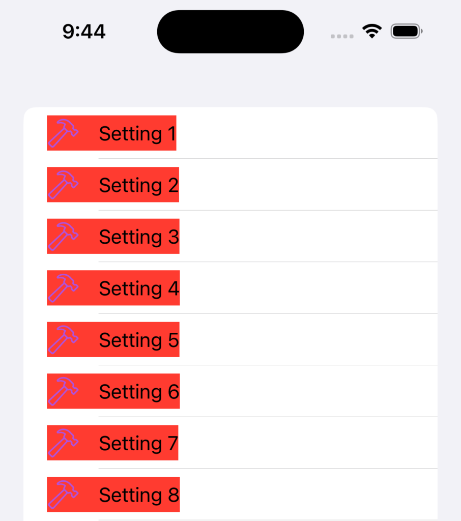
The HStack only takes the space it needs based on its content, which makes sense, but then how can I get a fully tappable row? I tried adding a spacer view after the label view to fill the remaining content but this would only accept taps if I also modified the background colour using a background modifier to the HStack (which is not ideal.) After more trials, error and searching around I found .contentShape(Rectangle()) in this nice article. Hurrah! After applying this modifier to the HStack in conjunction with a spacer view the whole row is tappable - job done! I even thought I'd be smart and make my own view:
struct TappableRowView<Content: View>: View {
    @ViewBuilder let content: Content
    var onTapGesture: () -> Void

    var body: some View {
        HStack {
            content
            Spacer()
        }
        .contentShape(Rectangle())
        .onTapGesture(perform: onTapGesture)
    }
}
So what is the .contentShape(Rectangle()) modifier? The documentation is relatively sparse, simply stating "Defines the content shape for hit testing." But in reality, that is all we want to change. We want to modify our HStack to tell the system that the hit test area is the whole view rather than just the label content inside of it. So by using this we are saying to use the whole rectangular shape. You could also use contentShape(shape) for non-rectangular shapes that require a different hit test region such as circles.
So It's Fixed?
Great, everything is fixed... except maybe not! A few days later I decided to do an audit of my app for VoiceOver. When interacting with the rows using the above solution, I was not hearing the "button" suffix read out from VoiceOver, which could be challenging for a user needing that functionality or something similar like Switch Control. How would they or iOS know it is a button to be tapped? I double checked this functionality with Xcode's Accessibility Inspector and verified that the row item had no Button trait, hence no read out, which makes sense, as it's not a button - doh!
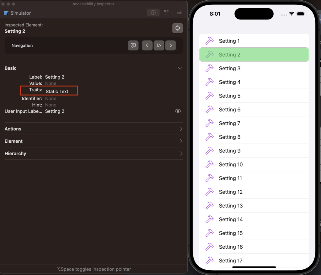
Tip: Accessibility Inspector is really handy to test accessibility features like Voice Over, without needing an audio read out from the simulator or device. It's accessible from Xcode's menu. Xcode > Open Developer Tool > Accessibility Inspector. However it can be a bit buggy, so the Mac app Reveal may also be useful to you.
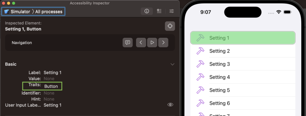
As a view has accessibility traits that can be modified, we can add some modifiers to make this work as expected; adding the isButton trait and removing the isStaticText trait:
var body: some View {
  HStack {
    content
    Spacer()
  }
  .accessibility(addTraits: [.isButton])
  .accessibility(removeTraits: .isStaticText)
  .contentShape(Rectangle())
  .onTapGesture(perform: onTapGesture)
}
Retesting the solution and success! The list row is fully tappable and as we can see below the button trait is now there and working correctly.
At this stage, I was feeling good but a small little voice crept in saying, is this right? Yes, functionally it is, but we're really starting to need to modify our HStack a lot to get something quite simple to work, so you have to ask, is there a better way? Adding the button trait above put buttons to the fore in my mind, so naturally I thought "why didn't I use a button here?". Admittedly it doesn't seem like a button as it's a standard table cell in UIKit parlance but those days are behind us now. So trying with a button:
struct ContentView: View {
    var body: some View {
        List {
            ForEach(1..<20) { num in
                Button {
                    print("Tapped setting \(num)")
                } label: {
                    Label("Setting \(num)", systemImage: "hammer")
                }
            }
        }
        .tint(.purple)
    }
}
The tapping is fixed, the full row performs as expected and voice over readouts correctly. However, my purple tint for the icons is now being applied to the text of the button.
So I thought again, easy (see a pattern yet?) I will make this a plain button, that normally removes all of these frivolities.
Button {
...
}
.buttonStyle(.plain)
Nice! It looks correct, so time to retest... The whole row is no longer tappable, back to square 1! I did find this surprising at first, as I wouldn't necessarily have linked buttonStyle to hit testing but I suppose when looking at a plain button it is just literal text, so would we expect the hit region to be outside of the text frame?
Ok, so let's not use the the plain button style, the only thing wrong here with the button automatic style is the label, so let's fix it. We can change the text back to our primary colour style by using the .foregroundStyle(.primary) modifier. However, this then makes our system image colour primary. The way I found to fix the label image colour so far is to use another initialiser for Label, taking in closures for both title and icon, allowing us to specify more detail for that content. A bit more verbose than before but also clearer in a way on where the styling is applied.
struct ContentView: View {
    var body: some View {
        List {
            ForEach(1..<20) { num in
                Button {
                    print("Tapped setting \(num)")
                } label: {
                    Label(
                        title: { Text("Setting \(num)") },
                        icon: { Image(systemName: "hammer").foregroundStyle(Color.purple) }
                    )
                }
                .foregroundStyle(.primary)
            }
        }
    }
}
Note: foregroundStyle(.primary) has to be applied to the button not the text view to fix the text style.
With the above changes and a quick retest I can verify the list item now looks correct, is fully tappable and has the correct trait for VoiceOver to work correctly.
Conclusion & Possible Solutions
So to wrap up, it seems there are at least three ways to solve this issue:
1: ContentShape with onTapGesture
Using the .contentShape(Rectangle()) and accessibility modifiers along with a tap gesture gives us everything we wanted, without many other headaches. However, adding modifiers to change accessibility to something its technically not could seem odd to others working on this codebase. If the contentShape was forgotten when doing this it's also highly likely the bug could slip through into production, without adequate automated or manual testing. If I were to use this I would wrap all of this functionality into a generic, reusable view to avoid the above. This could also be a useful solution for other tap gestures as well, not just single tap.
struct ContentView: View {
    var body: some View {
        List {
            ForEach(1..<20) { num in
                HStack {
                    Label("Setting \(num)", systemImage: "hammer")
                    Spacer()
                }
                .contentShape(Rectangle())
                .accessibility(addTraits: [.isButton])
                .accessibility(removeTraits: .isStaticText)
                .onTapGesture {
                    print("Tapped setting \(num)")
                }
            }
        }
        .tint(.purple)
    }
}
2: Button
This solution is very explicit in nature, describing what we want to happen here clearly with no additional modifiers for functionality, only styling. However, the needing to use a more in depth initialiser for Label in this scenario does make it the tiniest bit more verbose but that could be wrapped up into a smaller function or var if used regularly.
struct ContentView: View {
    var body: some View {
        List {
            ForEach(1..<20) { num in
                Button {
                    print("Tapped setting \(num)")
                } label: {
                    Label(
                        title: { Text("Setting \(num)") },
                        icon: { Image(systemName: "hammer") .foregroundStyle(Color.purple) }
                    )
                }
                .foregroundStyle(.primary)
            }
        }
    }
}
3: NavigationLink
Technically not a solution to the problem in strict terms, as it will only work by pushing a new destination view onto the navigation stack but if you want to show another view after tapping a list item in a modal presentation context consider if a push would work instead and get some lovely free baked in behaviour. It may also be worth checking in the HIG so see if you really need that modality.
struct ContentView: View {
    var body: some View {
        NavigationStack {
            List {
                ForEach(1..<20) { num in
                    NavigationLink {
                        Text("Setting \(num) content")
                    } label: {
                        Label("Setting \(num)", systemImage: "hammer")
                    }
                }
            }
        }
        .tint(.purple)
    }
}
Thank you for reading.